
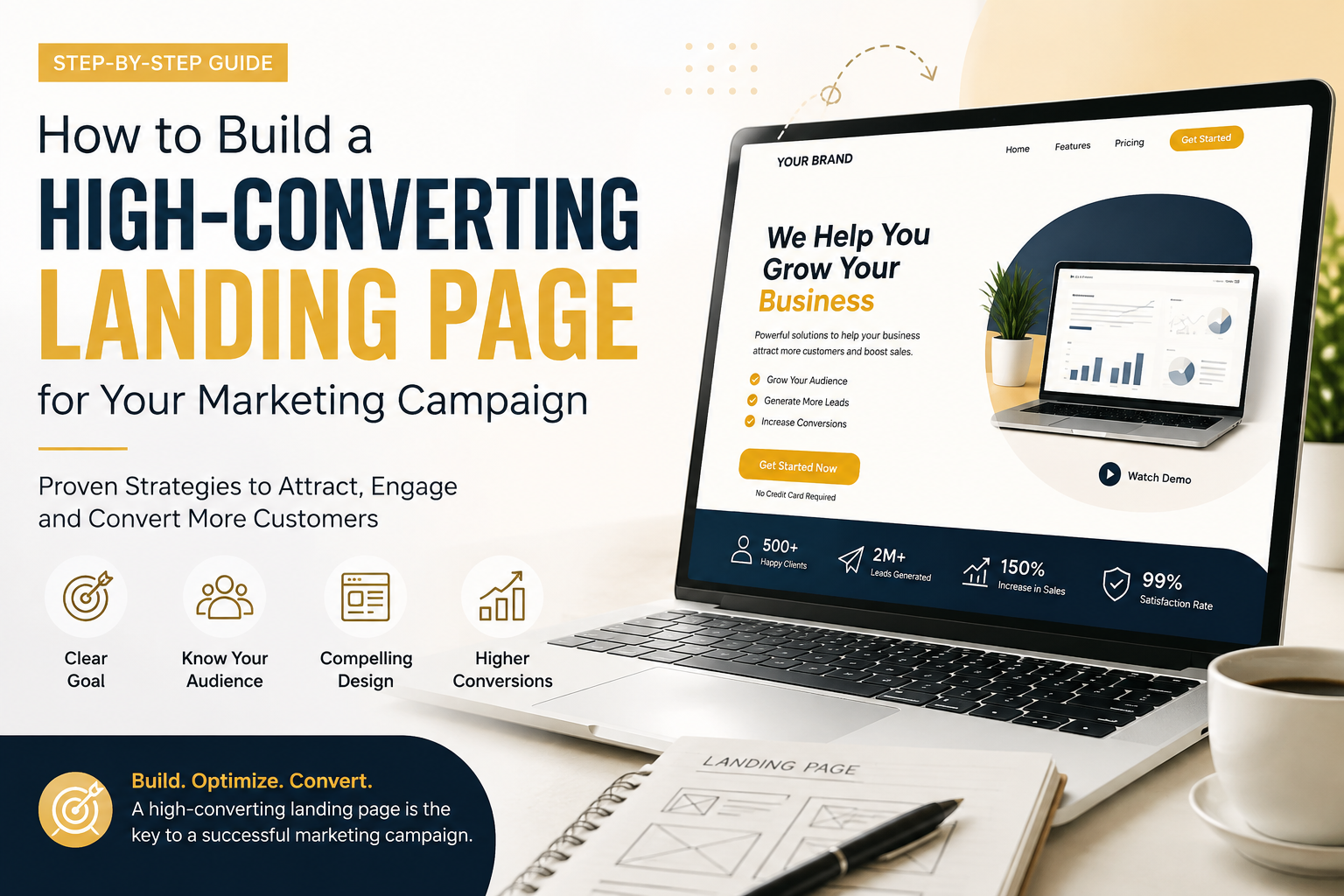
In digital marketing, traffic is only half the battle. You can run high-performing Google Ads, execute brilliant social media campaigns, or build a massive email list, but if your traffic arrives at a poorly designed landing page, your marketing budget goes straight down the drain.
A landing page is the bridge between a user’s initial interest and a completed conversion. Whether your goal is collecting email leads, selling a SaaS subscription, or booking discovery calls, building a high-converting landing page requires a mix of persuasive psychology, UX design, clear copywriting, and continuous optimization.
In this comprehensive guide, we will break down step-by-step how to construct a landing page that consistently turns passive clicks into paying customers.
1. Landing Page vs. Standard Website: Understanding the Difference
Before writing a single word of copy, it is essential to understand why standard website pages (like your homepage or “About Us” page) fail as campaign destinations.
A traditional homepage acts as an open map. It provides navigation menus, multiple links, company background, blog posts, and various paths a visitor can explore. This design works great for general brand discovery, but it gives paid traffic too many exits.
A high-converting landing page, on the other hand, is a dedicated destination built around one single objective. It strips away top navigation bars, footer links, and unnecessary distractions to focus the visitor’s attention entirely on taking one specific action.
| Element | Standard Homepage | High-Converting Landing Page |
|---|---|---|
| Primary Goal | Brand exploration & navigation | Immediate lead conversion or direct sales |
| Navigation Links | Full header and footer menus | Zero external links or minimal menu |
| Call to Action (CTA) | Multiple competing CTAs | Single, repeated campaign CTA |
| Target Audience | Broad public traffic | Highly targeted campaign audience |
2. The Core Anatomy of a High-Converting Landing Page
Every high-converting landing page relies on proven architectural elements designed to guide the reader logically down the page. Here is the structure you must follow.
A. Above the Fold (The First Impression Area)
“Above the fold” refers to everything a user sees on screen before they start scrolling. You have roughly 3 to 5 seconds to convince a visitor to stay.
- The Hero Headline: Your headline must be clear, compelling, and benefit-driven. Avoid clever jargon; state directly what problem your product solves or what value it delivers.
- Subheadline: The subheadline expands on the main offer in 1–2 sentences, clarifying how you deliver your promise or who your offer is specifically for.
- Hero Visual: Use a high-quality image, video thumbnail, or product graphic that shows your offer in action. Avoid generic corporate stock photos.
- Primary Call-to-Action (CTA): Your main button must stand out visually using high contrast colors. Use action-oriented copy like “Get Your Free Audit” instead of generic text like “Submit”.
B. Problem & Solution Mapping
Once you capture attention above the fold, you must validate why the visitor needs your product right now.
- Acknowledge the Pain Points: Briefly describe the specific problems, frustrations, or inefficiencies your target audience faces daily.
- Present the Solution: Introduce your product or service as the ultimate bridge that takes them from their current frustration to their desired outcome.
C. Feature & Benefit Breakdown
Never confuse features with benefits. Features tell users what a product does; benefits explain why it matters to them.
- Feature: “Automated reporting software.”
- Benefit: “Save 10 hours every week by letting automated systems generate your client reports instantly.”
Structure your feature-benefit section using 3 to 4 distinct blocks or bullet points featuring clean icons, short headlines, and 2-sentence descriptions.
3. The Power of Psychological Triggers and Social Proof
Humans rely heavily on social validation before making purchasing decisions online. Without visible trust factors, your conversion rate will stall.
Leveraging Social Proof
- Customer Testimonials: Include real quotes, customer names, titles, and headshots. Video testimonials convert even higher.
- Client Logos & Media Badges: Display recognizable logos of brands you have worked with or media outlets that have featured your business.
- Case Studies & Hard Metrics: Use real data points whenever possible (e.g., “Helped over 12,000 businesses increase email open rates by 34%”).
Reducing Risk Perception
Online buyers fear making a bad financial or time investment. You can easily overcome resistance by adding risk-reversal elements:
- Money-back guarantees (e.g., “30-Day Risk-Free Trial”).
- Trust badges (e.g., SSL certificates, secure checkout logos).
- Clear privacy statements (e.g., “We respect your privacy. Zero spam guaranteed.”).
4. Step-by-Step Guide to Building and Launching Your Page
[ Step 1: Persona Research ] ➔ [ Step 2: High-Value Offer ] ➔ [ Step 3: Direct Copywriting ] ➔ [ Step 4: UX & Responsive Design ] ➔ [ Step 5: Setup Tracking ]
Step 1: Define One Clear Persona & One Goal
Attempting to speak to everyone means appealing to no one. Identify your primary customer avatar for this specific marketing campaign. Are you targeting enterprise CEOs, freelance creators, or stay-at-home parents? Adapt your language, tone, and visual style accordingly.
Step 2: Build an Irresistible Offer
Your CTA button is only as good as the offer behind it. If your conversion offer feels weak, visitors will bounce.
- For B2B/SaaS: Offer interactive product demos, free audits, or 14-day full-access trials.
- For B2C/Ecommerce: Offer exclusive first-order discounts, free shipping thresholds, or downloadable shopping guides.
Step 3: Write Clear, Scannable Copy
Web users rarely read pages word-for-word; they scan.
- Use concise paragraphs (2-3 sentences max).
- Utilize bold text to emphasize critical phrases.
- Break up text blocks with bullet points, numbered lists, and iconography.
Step 4: Optimize for Mobile Devices First
Over 55% of all global web traffic originates from mobile devices. If your landing page looks great on desktop but breaks or loads slowly on smartphones, you are burning ad budget.
- Keep form fields to a minimum (ask only for essential information like name and email).
- Ensure CTA buttons span wide enough to tap easily with a thumb.
- Compress images to maintain fast page load times under 2 seconds.
5. Essential Metrics to Track and A/B Testing Strategies
Launching your landing page is not the final step; continuous optimization determines long-term ROI.
Core Landing Page Metrics
- Conversion Rate (CR): The percentage of total page visitors who complete the target action.Conversion Rate=(Total Page VisitorsTotal Conversions)×100
- Bounce Rate: The percentage of visitors who exit the page without interacting.
- Cost Per Acquisition (CPA): How much ad spend is required to acquire a single conversion through the landing page.
Running Successful A/B Tests (Split Testing)
Never guess what works—test it empirically. Use testing tools like VWO or Google Optimize (or built-in page builder tools) to create variation pages and test one element at a time:
- Headline Variations: Test a direct benefit headline against a curiosity-driven headline.
- CTA Button Colors & Copy: Test “Get My Free Guide” vs. “Download Now”.
- Form Length: Test a 2-field short form against a 5-field qualified form.
- Visual Media: Test a static hero image against a short 60-second explainer video.
Final Thoughts
Building a high-converting landing page is an iterative process grounded in clarity, customer empathy, and continuous data analysis. By focusing on a singular call to action, delivering strong benefit-driven copy, presenting unquestionable social proof, and optimizing for mobile speed, you transform your landing page into a reliable lead generation engine for your business.